Tuesday, May 8, 2012

Assignment 20: Research and Inspiration

Research:

Who is Shepard Fairey?

Born February 15, 1970, he is an american contemporary graphic designer. He designed a poster for the then presidential candidate Barack Obama in 2008. The original version saying "progress" changed to the word "hope" in less than a week. Fairey being married to Amanda. He also created other well known posters such as Obey Giant, Rock the Vote (another poster for obama), Andre the Giant, and the Hope poster. He attended the Rhode Island Institute of Contemporary Arts, in Boston. However he is known for his poster for the presidential campaign of barack obama.

Fairey's Work:


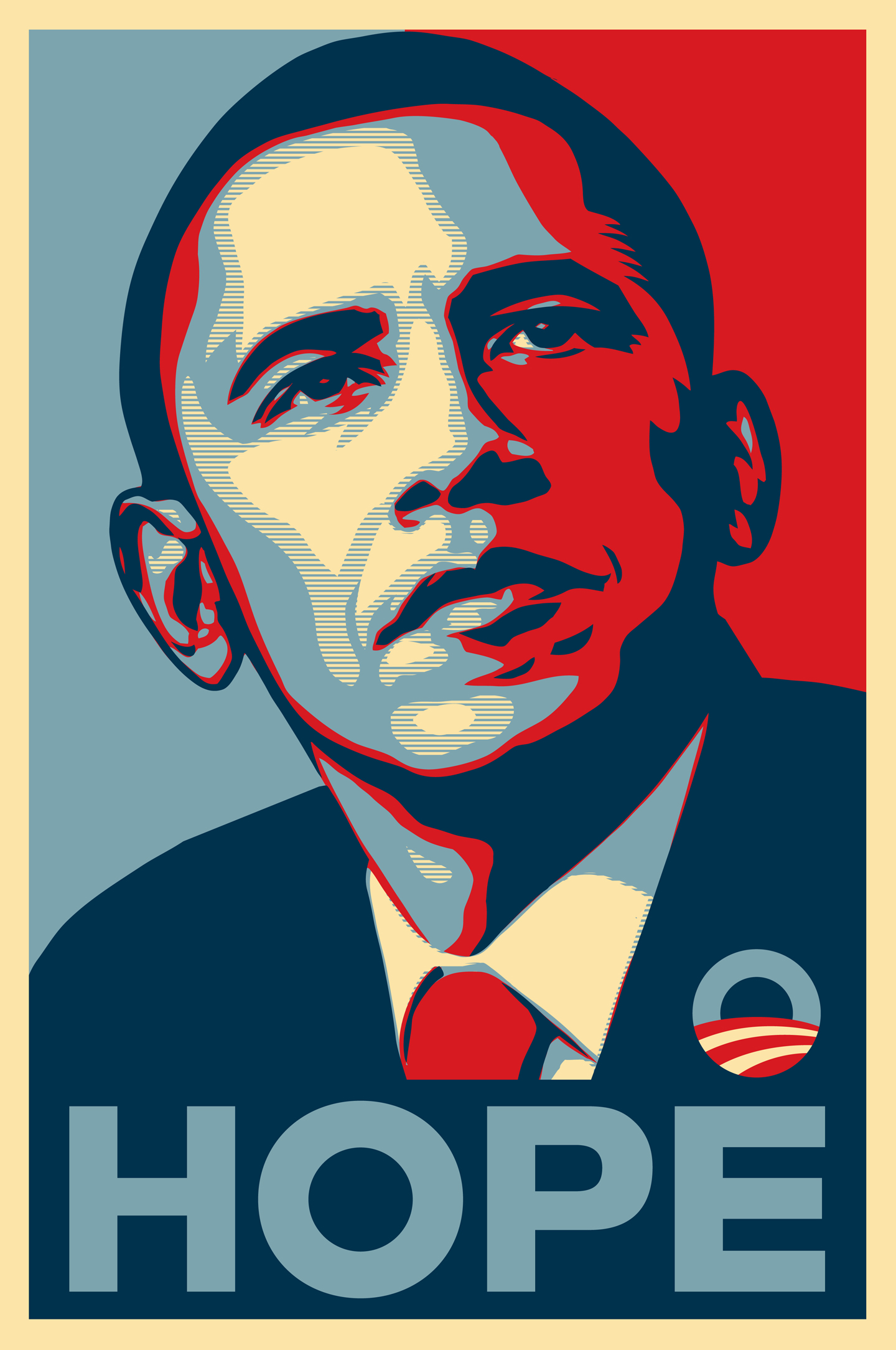
This is the picture that Fairey is well known for, this specific design was used in Barack Obama's campaign. (now president).

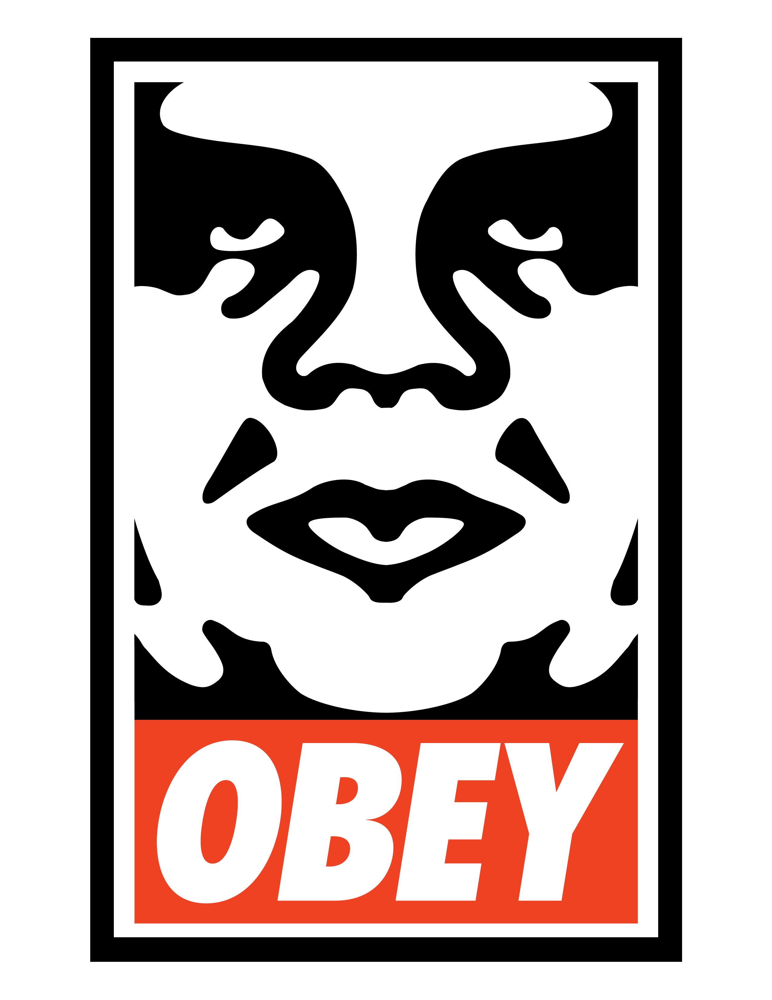
This is one of his newly released works.

Research:

For assignment #20 our last assignment we are suppose to be making a Poster and Logo for a social issues. My ideas for which social issue I should use include:

1) animal abuse
2) Obesity
3) Suicide
4) Bullying


This is a really interesting poster that i fell in love with and I will like to create a poster that may look somewhat like the way this poster was put together.


I love the way they use an illusion when creating a poster that shows that by smoking you are killing yourself which was a interesting design to me.


This one is telling you that watching tv and playing video games are the cause of all mass destruction.

Tuesday, April 24, 2012

Assignment #19: Research and Inspiration

Research:
This specific assignment has us creating a stationery package.
-A Stationery Package is what we make for businesses to have there name on various materials and to help support there companies.
-Developing a business card is the first step to the stationery package.
-When developing the business card you have to think about what the viewers will be interested in looking at.
-Some of these different companies are either serious of fun.
-The names we were given to work with can be seen below:


Azul Salon and Spa- this particular place most likely wants young women and teenagers in there company so you want to use company names that may attract women (bright colors) pinks and other girly colors.

Ted's Hot Wings- this place reminds of a place that men would hang out at. this means that i would want to idolize the colors orange as well as brown because that is the color of wings and this is a wings place.

The Candy Shop- A candy store would be a place where you would want to have soft colors and have fun with everything that you make because it is for all ages.

Inspiration for Business Cards:


THis one had nice colors and a nice background to make it look extra nice. Then it is very symmertic.
I think this design was a cute one and also told all the info needed in a nice way

This business card uses the thought of simplicity and how to make everything look nice.

Inspiration for Letterhead: 
This letterhead got my attention because it uses the same colors that were in the logo i also like how there is a kangaroo in the center of this and it has a low opacity so that it looks nice together and they had a great distribution of the colors and the way letterheads should look.

In this design they have this line that i like the line makes me want to read whatever would be on this paper which would be good for the designer. I would maybe want to use this style in my design that i will create. I really like this design.


This design is silly and I like how all the information is at the top and nothing at the bottom of the design this gives more space for the employer to write to the client in which he needs to speak with which i really like.


Inspiration for Envelopes:


This specific envelope shows how much you do not need to have a lot on your envelope because it is just going to be disposed of anyway.


This shows the consistence that is used when creating this specific design. I like this design because you have several different options to make this design add up and make sense to the viewer of the design/client.

Stationery Package

Stationery Package 
The printed pieces that a company utilizes for communication purposes (business card).
*Important that all communications are well coordinated and that the message of the organization is presented CONSISTENTLY.
*Basic package includes: Business Card, Letterhead, and Envelope.
Business Card
- most important part
- when looking at business card tells people how to find you
- gives people a opinion on you
- colors, shades, fonts, texture, and gloss all matter when making a business card.
*Includes
logo, company name, employee name, title, phone number, fax number, email address, company address, and web address.
*Design Tips
- must be 2"x3.5"
- horizontal or vertical orientation
- check for accuracy
- check for unity, continuity among other pieces
- typical margin .25" to .125"
Letterhead
- a printed piece of paper used to send letters, memos, etc.
*typically includes:
- logo
- company name
- company address
- phone number
- fax number
- web address
90% of the page has no graphics and then 10% does usually (a lot of blank space).
*design tips:
- must be 8.5x11 (standard)
- must be vertical orientation
- must leave room to write the letter, memo, etc. big space in middle
- check for accuracy
- check for unity, continuity among other pieces.
Envelope
- the packaging that contains the letter/form when being mailed
- standard #10 envelope (basic)
*typically includes:
- logo
- company name
- company address
design tips:
-must be 9.5x4.125
-horizontal or vertical orientation
-must leave room for recipient's address and stamps
-check for accuracy
-check for unity, continuity among other pieces.
- LEAVE A MARGIN FOR THE DESIGN!

Thursday, April 19, 2012

Assignment 18: Research and Inspiration

In this assignment we are idolizing the logotype form which are known as wordmarks. Wordmarks being logos that only use the name of the specific company.
- we were given three different choices of different companies that we could make a design out of they were called "In Focus Photography", "St. Henri Hotel", and "Mimi's Flower Shoppe."

Ideas
- making the top part of the design the main focus of words then the second line the other word in a different font and size
- Maybe for one use relatively dark pantone colors for the In Focus Photography (need to research new colors that people are using in this field.
- maybe create a border around the letters somehow

Research Colors
- Red PMS 485
- dark grays
- baby blue colors
- a light yellow

Industry Trends
- using the handwriting font
- a more modern font
- they utilize the different spaces and the figure/ground

Inspiration:


Yogo
I like this logo because it has a fun feeling towards it with the font and the way it looks like you could just touch it if you wanted to do so also the color used makes it fun to look at and it draws the viewer in the picture.

Playground
I love how in this particular photo they use the element of allusion of making something look one way when in actuality it is another way and does not come out like that.
La Femme

I like how in this logo design they played a trick on words and the "e" looks like it could have been a heart instead of an "e" that you see and believe is there, maybe i can idolize that within my design.

Friday, April 13, 2012

Assignment 17: Research and Inspiration

Research:
During this assignment we are making a combination mark/logo design, i choose to make a logo for, "Pear Incorporated."


Logo Design- a name designed for easy and definite recognition, especially one borne on a single printing plate or piece of type. (freedictionary.com)

"Pear Incorporated" thoughts
- apples
- cherry's
- pears
- fruit baskets
- fruit basket catering company
- fruit on a plate
- a chef's hat with a face in the figure and ground
- fork going into a pear
colors?
- green and white?

What is new in the logo design of food lately?
- many designs that i saw on the internet on food design contained several areas of both positive as well as negative space.
- some have pictures of the place that there food originated from in the background
- some have a assortment of words that makes reading it more interesting and draws you in 
- some have the design and name of the company intertwined meanwhile others have the design and the name separate

Pantone (PMS) Colors?
- Pantone 17-1463 is the color of the year
- Pantone 14-0116
- Pantone 13-0759
- Pantone 19-3953
- Pantone 18-3628
- Pantone 14-5420
- Pantone 18-1210
- Pantone 16-1120

Inspiration:
This design I like because it is simple and only idolizes two different colors that are significant to this particular culture. 

These colors are known for drawing people into a store because these colors make you hungry and these maybe good colors to use because of that fact.

I like the way this designer used the chef and made the chef the main thing then had the words or name of the company surround that part. 

Wednesday, April 11, 2012

Logotype

Logotype
a graphic mark commonly used by commercial enterprises, organizations and even individuals to aid and promote instant public recognition also known as LOGO

-industry in 18th and 19th century contributed to the making of the typography that led to logotype.
-in the 1950s a commercial movement in the us began and the new generation of graphic designers was created.
-logos proved to be successful in the era of mass visual communication used with television, printing technologies as well as digital innovations
-LOGO design is an important area of graphic design and one of the most difficult to perfect.


LESS IS MORE...
real people in real life situations do not stare at and analyze logos, they just "see" it and a quick glance will not be enough to get all the details in a complex logo, needs to be simple but have enough personality that it stands out in a crowd
-modernism made a logo simple and reconcilable

5 Principles of Effective Logo Design
1) Simple- simplicity makes a logo easy to recognize and memorable. Good logos feature something unexpected or unique without being "overdrawn" KEEP IT SIMPLE.
2) Memorable- make the logo so that it is memorable no matter what. when someone sees it
3) Timeless- Will it still be effective in 10 or 20 years? Will yours stand the test of time.
4) Versatile- Make sure your logo will look good on a teeshirt, printed out, post card, business card looks good on EVERYTHING. Most logos are made in Illustrator
AS THESE QUESTIONS..
IS IT IN ONE COLOR? 
IN REVERSE COLOR?
THE SIZE OF A POSTAGE STAMP?
AS LARGE AS A BILLBOARD?
5)Appropriate- design for your client not for yourself.

COLOR
Spot Color: 
method of specifying and printing colors in which each color is printed with its own ink. only contains only one or three different colors, but it becomes prohibitively expensive for more colors.
Pantone Matching System (PMS):
A system by a company called Pantone. EVERY printer in the world uses this source/type of ink.
Choose your colors wisely because...
- color plays an important role in logo design. color can illicit different feelings and emotions from the audience.
- interpretation of color may vary depending on age, gender, and cultural demographics. colors also tend to follow tends, just like fashion.
- so a new vibrant company may want to follow current trends, whereas a bank may choose to stay with conservative colors.
- keep color palettes to usually 1 or 2, 3 only if you have a good reason for it.

Combination Mark- logo or design with text or some type of visual


Iconic/ Symbolic
Symbolic is more abstract (like icons at the beginning) nike is a great example for this one.

Wordmark/Lettermark- logos that only have text wordmark has full company name and lettermark has only initials.